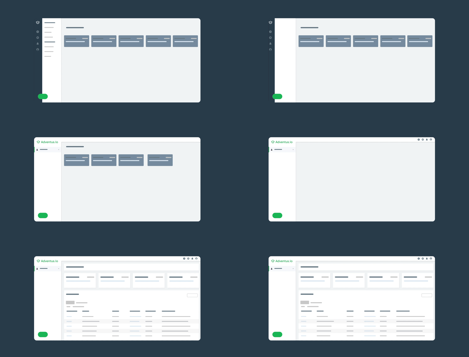
When you next log in to the Adventus.io marketplace, you will notice that things look a little different around here.
Our User Experience (UX) team has listened to all the feedback they’ve received from customers over the last year and introduced a brand new look and feel across the platform – and we’re really proud of the results.
Whether you’re a counsellor, student, or at a partner institution, we know you all have something in common: you’re really busy.
This marketplace-wide refresh is designed to simplify your experiences when using Adventus.io – so you can find things quickly, navigate the platform seamlessly, and focus on what counts.
As always, our goal is to provide the simplest and fastest way for recruiters to get students into the right courses.
Here are some of the key changes we’ve made – and what you need to know.
More intuitive navigation
You told us that it’s a powerful platform – but sometimes the sheer number of functions could seem a bit overwhelming. So, we’ve worked hard to make the complex more simple.
We’ve reduced the overall visual complexity of the design and made the navigation and menu structure more intuitive, to help you find things even quicker and be more productive.
Accessible for all users
We’re changing the way the world accesses international education – so ensuring that the marketplace is accessible to all users is absolutely vital to us.
We’ve made sure our updated User Interface (UI) adheres to the latest Web Content Accessibility Guidelines (WCAG). We’ve tweaked the way we display content, so it’s more accessible and consistent right across the platform.
Specifically, we’ve paid attention to how we display images, colour, and typography, to make sure we’re addressing any potential barriers for our users.
But wait, there’s more
These changes are the first in a series of user experience enhancements. We’ve got some other big things in the pipeline too.
Our UX team will soon begin reimagining task workflows – including how to search for and shortlist courses, manage documents, and submit applications.
We’ll be expanding the Student Portal, which gives students the power to log in, upload documents, and check the status of their applications. This will help save recruiters time, while still giving them control over guiding their students.
We’re taking a phased approach so we can work with you to see what works. Stay tuned for more updates about these upcoming enhancements.
How are we doing it?
It may sound obvious but the key to designing a seamless user experience is listening to and understanding the experiences and needs of our customers.
Over the next few months, we’ll be reaching out to ask what you like about these changes and what else we can do to ensure our marketplace is the simplest and most intuitive experience it can be.
To learn more about our approach to User Experience (UX), read more from our Head of UX Matt Arthur.
Let us know what you think. Log in to Adventus.io to check out what’s new and don’t be afraid to send us your feedback.


